Understanding Skin Tones and Undertones: The Foundation
Before exploring specific color recommendations, you need to understand two critical concepts: skin tone and undertone. Most people confuse these terms, but they're distinctly different and both matter for choosing flattering nail colors.
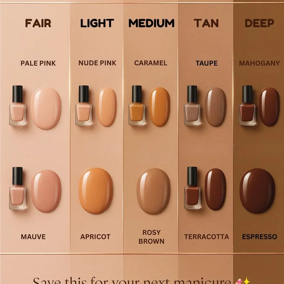
Skin tone refers to the surface color of your skin fair, light, medium, tan, deep, or dark. This is what you see immediately when you look at your skin in natural light.
Undertone is the subtle hue underneath your skin's surface. It remains constant regardless of sun exposure or tanning. There are three undertone categories: cool (pink, red, or bluish), warm (yellow, peachy, or golden), and neutral (balanced mix of cool and warm).
Your undertone matters more than your surface skin tone when selecting nail colors. A fair person with warm undertones and a deep-skinned person with warm undertones will both look stunning in similar color families, despite their different surface tones.
The Vein Test: Your Quick Undertone Identifier
The fastest, most reliable method for determining your undertone requires nothing but natural lighting and your bare wrist.
Look at the veins on your inner wrist in natural daylight. Not artificial light actual sunlight or bright daylight from a window.
Blue or purple veins indicate cool undertones. Your skin has pink, red, or bluish hues beneath the surface.
Green veins signal warm undertones. Your skin carries yellow, peachy, or golden hues underneath.
Blue-green veins or difficulty distinguishing the color means neutral undertones. You have a balanced mix and can wear both warm and cool shades successfully.
This test works across all skin tones from the fairest to the deepest. Undertone isn't determined by how light or dark your skin appears, but by the hue beneath.

Secondary Undertone Tests
If you're still uncertain after the vein test, these additional methods provide confirmation:
Jewelry test: Hold gold and silver jewelry against your skin. Cool undertones look better in silver, white gold, and platinum. Warm undertones glow in yellow gold, rose gold, and copper. Neutral undertones suit both equally.
White fabric test: Hold pure white fabric next to your face in natural light. If your skin looks pink or rosy, you're cool-toned. If it looks yellow or golden, you're warm-toned. If it looks balanced, you're neutral.
Sunburn pattern: Cool undertones tend to burn easily and tan minimally. Warm undertones tan easily and burn less. Neutral undertones fall somewhere between.
Fair Skin Tones: Your Color Palette
Fair skin encompasses the lightest skin tones, often described as porcelain, ivory, or pale. Within fair skin, undertones create dramatically different optimal color palettes.
Fair Skin with Cool Undertones
Your skin has pink or rosy hues. You likely have light eyes (blue, gray, or green) and naturally blonde, brown, or black hair with ash tones.

Your power colors:
Jewel tones create stunning contrast against fair cool skin. Sapphire blue, emerald green, amethyst purple, and ruby red make your hands pop without overwhelming your complexion. These rich, saturated colors provide the perfect amount of contrast.
Berry shades are your secret weapon. Raspberry, wine, plum, and burgundy complement cool undertones beautifully. These colors add sophistication and work for both professional and social settings.
Blue-based reds look incredible on fair cool skin. True reds with blue undertones (think classic Hollywood red) enhance your natural coloring. Avoid orange-reds or tomato reds they clash with cool undertones.
Soft pinks with blue undertones suit everyday wear. Think dusty rose, mauve, and lavender-pink rather than peachy or coral pinks.
Navy and deep charcoal serve as elegant neutrals that won't wash you out like beige can.
Colors to avoid: Warm oranges, corals, mustard yellows, and peachy tones fight against your natural coloring. Shades too close to your skin tone (pale beige, light nude) create a washed-out effect.


Fair Skin with Warm Undertones
Your skin has peachy or golden hues. You likely have warm-colored eyes (brown, hazel, amber, warm green) and hair with golden, red, or warm brown tones.

Your power colors:
Coral shades were made for warm-toned fair skin. From soft coral to vibrant orange-red coral, these shades enhance your golden undertones and create a fresh, glowing effect.
Peachy pinks look natural and flattering. These colors blend beautifully with your warm undertones while adding polish and sophistication.
Golden nudes provide the perfect neutral. Choose beige with peachy or golden undertones rather than gray or pink-based nudes.
Warm reds with orange undertones (tomato red, poppy red) complement your coloring better than blue-based reds.
Mint and sage greens create beautiful contrast without clashing with warm undertones.
Terracotta and rust tones work surprisingly well, adding earthy sophistication.
Colors to avoid: Cool-toned pinks, blue-based reds, icy silvers, and gray-toned nudes fight your warm undertones. These colors can make fair warm skin look sallow or tired.
Fair Skin with Neutral Undertones
You're the chameleon both warm and cool colors flatter you. Your vein test showed blue-green veins, and you look good in both gold and silver jewelry.
Your advantage: You have the widest color range available. Most shades work beautifully on your balanced undertones.
Strategic approach: Choose colors based on desired effect rather than undertone matching. Want drama? Go bold with jewel tones. Want soft romance? Choose dusty pastels. Want modern edge? Try unconventional shades like gray, taupe, or olive.
Versatile choices: Mauve, dusty rose, greige (gray-beige), soft lavender, and muted terracotta work universally well on neutral undertones.
Medium Skin Tones: Your Color Palette
Medium skin includes beige, tan, and golden brown tones. This category encompasses the widest range, from light tan to deeper caramel complexions. Undertone identification remains crucial for selecting your most flattering shades.
Medium Skin with Cool Undertones
Your medium skin has pink, red, or rosy undertones. You might tan but maintain pink undertones even with color.

Your power colors:
Rich plums and deep mauves create sophisticated elegance. These colors have enough depth to show beautifully against medium skin while complementing cool undertones.
Magenta and fuchsia pop dramatically. These bold pinks work better on medium skin than they do on very fair or very deep tones.
Berry reds with blue undertones look stunning. Think cranberry, wine, and deep rose rather than orange-reds.
Deep teals and peacock blues provide unique sophistication. These colors offer the richness needed for medium skin with the cool undertones that match your complexion.
Cool-toned metallics like silver chrome, gunmetal, and icy champagne create modern statements.
Colors to avoid: Muddy browns, warm oranges, and yellow-based golds can clash with cool undertones. Very pale colors may lack the contrast needed to show up well.


Medium Skin with Warm Undertones
Your medium skin carries golden, peachy, or yellow undertones. You tan easily and your natural coloring has warmth.

Your power colors:
Burnt orange and terracotta look absolutely stunning on medium warm skin. These earthy tones enhance your golden undertones and create cohesive, polished looks.
Golden nudes and caramel serve as perfect neutrals. Choose shades with obvious warmth think latte, toffee, and sand.
Warm reds with orange undertones (poppy, tomato, brick red) complement your coloring beautifully.
Olive and moss greens create unexpected sophistication. These nature-inspired tones harmonize with warm undertones.
Warm metallics like rose gold, copper, and antique gold look luxurious and flattering.
Rich chocolates and coffee browns work beautifully as sophisticated neutrals.
Colors to avoid: Cool pinks, icy blues, gray-toned nudes, and silver shades can appear disconnected from your warm natural coloring.
Medium Skin with Neutral Undertones
Your balanced undertones give you flexibility across the color spectrum.
Your advantage: Most colors work well, allowing trend experimentation without undertone conflicts.
Universal choices: Dusty rose, greige, soft burgundy, sage green, and muted coral work consistently well. These balanced shades enhance medium neutral skin without requiring specific undertone matching.
Olive Skin Tones: Your Color Palette
Olive skin has distinctive green or yellow undertones, sometimes appearing almost golden-green. This unique undertone category includes light olive through deep olive shades. Olive skin typically tans easily and rarely burns.

Your power colors:
Emerald and jade greens create harmonious beauty. These green-based jewel tones complement olive skin's natural green undertones rather than competing with them.
Deep burgundy and oxblood provide rich, sophisticated options. These colors have enough depth and warmth to flatter olive complexions.
Bronze and antique gold look luxurious on olive skin. These metallic shades enhance the golden elements in olive undertones.
Burnt sienna and rust tones work beautifully. These warm, earthy colors harmonize with olive skin's natural warmth.
Rich plums with warm undertones create elegant contrast without clashing.
Peachy nudes serve as flattering neutrals. Choose nudes with golden or peachy undertones rather than pink or gray bases.
Colors to avoid: Very cool pinks can clash with olive's warm-green undertones. Overly yellow shades may blend too much with your natural coloring. Extremely pale colors may not provide enough contrast.


Strategic tip: Olive skin can pull off colors that other undertones struggle with. Experiment with unusual shades like olive green, mustard gold, and copper these often look stunning on olive complexions.
Deep Skin Tones: Your Color Palette
Deep skin encompasses rich brown through dark ebony tones. These gorgeous complexions can wear bold, saturated colors that would overwhelm lighter skin tones. Deep skin makes statement colors truly shine.
Deep Skin with Cool Undertones
Your deep skin has blue, purple, or rosy undertones beneath its rich surface color.

Your power colors:
Bright fuchsia and hot pink create dramatic impact. These vibrant shades show up beautifully and create stunning contrast against deep cool skin.
Electric blue and royal purple make bold statements. Deep skin provides the perfect canvas for these saturated, cool jewel tones.
Berry shades from raspberry to deep plum work gorgeously. These colors maintain visibility while complementing cool undertones.
Metallic silvers and chromes look ultra-modern and striking. Cool metallic finishes create futuristic statements on deep skin.
Deep burgundy and wine provide sophisticated elegance for professional settings.
Colors to embrace: Deep cool skin can wear the brightest, most saturated versions of cool colors don't shy away from bold choices.
Colors to avoid: Muddy browns, warm oranges, and yellow-based golds fight against cool undertones. Very pale pastels may lack the saturation needed to show up well.
Deep Skin with Warm Undertones
Your deep skin carries golden, amber, or copper undertones beneath its surface.

Your power colors:
Rich chocolate and deep caramel serve as stunning neutrals. These deep, warm shades enhance your natural coloring while maintaining sophistication.
Copper and bronze metallics look absolutely luxurious. These warm metallic tones complement your golden undertones beautifully.
Burnt orange and rust create bold, cohesive statements. Deep warm skin can wear these challenging colors with confidence.
Deep red with orange undertones (brick red, terracotta red) looks rich and expensive.
Olive and forest greens provide unexpected sophistication. These earthy tones harmonize with warm undertones.
Gold metallics from antique to bright yellow gold all flatter deep warm skin.
Colors to embrace: Saturated warm tones that would overwhelm other skin tones look incredible on deep warm skin.
Colors to avoid: Cool pinks, icy blues, and gray-based shades can appear disconnected from your warm coloring.
Deep Skin with Neutral Undertones
Your balanced undertones allow you to wear both warm and cool shades successfully.
Your advantage: You can wear the full spectrum of bold, saturated colors. Both warm and cool shades complement your balanced undertones.
Universal power colors: Saturated jewel tones (emerald, sapphire, ruby), rich metallics (gold, silver, copper), deep berries, and bold oranges all work beautifully.
The Nude Nail Dilemma: Finding Your Perfect Match
Nude nails remain perpetually popular, but "nude" isn't one universal shade. Your perfect nude should match your natural skin tone and undertone, creating a seamless, polished look.
Finding Your Nude
Fair cool skin: Pink-toned or light beige nudes. Look for shades described as "ballet pink," "porcelain," or "ivory" with pink undertones.
Fair warm skin: Peachy or golden light beiges. Search for "honey," "champagne," or "warm ivory" shades.
Medium cool skin: Rosy beiges and cool taupes. Try "dusty rose nude," "mauve taupe," or "cool sand."
Medium warm skin: Latte, caramel, and warm beiges. Look for "golden sand," "warm taupe," or "toffee nude."
Olive skin: Peachy or golden medium nudes. "Toasted almond," "golden beige," and "warm sand" work well.
Deep cool skin: Rich taupe and cocoa shades with cool undertones. Try "mocha mauve" or "cool chocolate."
Deep warm skin: Chocolate, caramel, or rich amber nudes. Look for "warm cocoa," "caramel latte," or "bronze nude."
The test: Your perfect nude should be one to two shades darker or lighter than your natural nail bed, not drastically different. Hold swatches against your bare nails in natural light.
2026 Trending Colors: What Works for Your Skin Tone
Understanding how 2026's trending colors translate across different skin tones helps you adopt trends that actually flatter you.
Mocha Mousse (Pantone 2026)
This warm chocolate brown works across most skin tones but requires undertone matching.
Who it flatters most: Medium to deep skin with warm or neutral undertones. The warm brown enhances golden undertones beautifully.
Fair skin approach: Cool-toned fair skin should skip this trend. Warm-toned fair skin can wear it but may prefer a lighter, more caramel version.
Styling tip: Pair with gold jewelry and warm-toned outfits for cohesive looks.
Aura Nails
These gradient designs work universally but color selection matters.
Fair skin: Use soft pastels or jewel tones matching your undertone.
Medium skin: Can use bolder color transitions and more saturated shades.
Deep skin: Embrace the brightest, most dramatic color combinations for maximum impact.
Glass Nails
This ultra-glossy trend works across all skin tones since it's about finish, not color. Choose your base color according to your undertone for best results.
Jelly Nails
Translucent shades work universally but require undertone matching.
Cool undertones: Choose jelly finishes in berry, blue, or cool pink shades.
Warm undertones: Select jelly finishes in coral, peach, or warm pink tones.
All skin tones: The sheer quality makes this trend very forgiving.
Professional Settings: Skin Tone Considerations
Professional environments often require subtle nail colors. Here's how to stay workplace-appropriate while flattering your skin tone.
Conservative Professional Settings
Fair cool skin: Soft mauve, dusty rose, sheer pink, or navy.
Fair warm skin: Peachy nude, soft coral, or warm beige.
Medium cool skin: Rose taupe, soft plum, or cool gray.
Medium warm skin: Warm taupe, soft terracotta, or golden nude.
Olive skin: Peachy nude, soft sage, or warm taupe.
Deep cool skin: Deep mauve, burgundy, or rich taupe.
Deep warm skin: Chocolate brown, deep caramel, or bronze.
Universal professional shades: Deep burgundy, navy, and properly matched nudes work across most professional settings and skin tones.
Common Mistakes and How to Avoid Them
Mistake 1: Ignoring Undertones
Choosing colors based only on surface skin tone leads to unflattering results. A color that looks stunning on someone with your same skin tone might look terrible on you if your undertones differ.
Solution: Always consider undertone first, then select within appropriate color families for your skin tone depth.
Mistake 2: Copying Celebrity Looks Without Adaptation
What looks incredible on a celebrity may not flatter you if you have different undertones or skin tone depth.
Solution: Identify the celebrity's undertone and skin tone. If they differ from yours, adapt the color to your coloring rather than copying exactly.
Mistake 3: Assuming One "Nude" Fits All
Generic nude polishes often look too pink on warm skin, too yellow on cool skin, or washed out on deep skin.
Solution: Swatch multiple nudes on your actual nails. The right shade should enhance your natural coloring, not fight it.
Mistake 4: Avoiding Bold Colors on Deep Skin
Some believe deep skin should stick to dark colors. This wastes deep skin's unique ability to showcase bright, saturated shades.
Solution: Deep skin can wear the boldest versions of colors across the spectrum. Embrace this advantage.
Mistake 5: Choosing Colors Too Close to Skin Tone
Especially on fair skin, colors nearly identical to skin tone create a washed-out, unpolished appearance.
Solution: Create contrast. Choose colors distinctly different from your natural skin tone for definition and impact.
Seasonal Adaptations for Your Skin Tone
Your best colors remain consistent, but seasonal styling varies.
Spring Colors
Fair skin: Soft corals, light lavenders, mint greens (matched to undertone).
Medium skin: Peachy pinks, soft yellows, sage greens.
Olive skin: Soft olives, peachy nudes, warm lilacs.
Deep skin: Bright pastels, saturated spring colors, vibrant corals.
Summer Colors
Fair skin: Bright jewel tones, vibrant berries, clean whites (cool undertones) or corals (warm undertones).
Medium skin: Bold tropical colors, bright pinks, vivid oranges (matched to undertone).
Olive skin: Rich coral, bright turquoise, warm berries.
Deep skin: Neon brights, electric colors, bold metallics.
Fall Colors
Fair skin: Deep berries, burgundies, forest greens (matched to undertone).
Medium skin: Rust, deep plum, olive greens.
Olive skin: Burnt orange, deep olive, rich bronze.
Deep skin: Rich chocolate, deep burgundy, copper metallics.
Winter Colors
Fair skin: Deep jewel tones, burgundy, navy, berry shades.
Medium skin: Deep plums, rich wines, emerald greens.
Olive skin: Deep burgundy, forest green, bronze.
Deep skin: Deep jewel tones, metallic silvers and golds, rich berries.
Testing Colors Before Committing
Never buy nail polish without testing how it appears on your actual skin.
In-store method: Most stores allow swatching. Paint one stroke on your nail if possible, or on your inner wrist if nail testing isn't allowed. View in both store lighting and near a window for natural light assessment.
Online shopping method: Read reviews from people describing their skin tone and undertone. Look for reviewer photos showing the polish on actual hands. Check return policies before purchasing.
Sample sets: Many brands offer mini collections. These allow testing multiple shades affordably before committing to full bottles.
Natural light rule: Always make final color decisions in natural daylight. Artificial lighting distorts color perception dramatically.
Multi-Tone Manicures: Coordination Strategies
Mixing multiple colors requires understanding which combinations flatter your skin tone.
Cool undertones: Combine colors from the cool spectrum berries with plums, blues with pinks, silver with gray.
Warm undertones: Mix warm-spectrum colors corals with golds, oranges with bronzes, peachy pinks with warm reds.
Neutral undertones: You can mix warm and cool successfully. Try dusty rose with sage, or mauve with soft terracotta.
Accent nail strategy: Use your best neutral as the base (four fingers), then add a bold accent matching your undertone on the ring finger.
The Psychology of Color and Skin Tone
Beyond flattering your complexion, nail colors convey specific messages that interact with your skin tone.
Deep reds: On fair skin, create classic drama. On medium skin, appear sophisticated and powerful. On deep skin, make bold, confident statements.
Soft pinks: On fair skin, seem youthful and fresh. On medium skin, appear professional and polished. On deep skin, create unexpected softness.
Bold brights: On all skin tones signal confidence, but deep skin showcases them most dramatically.
Nudes: When properly matched to skin tone, appear effortlessly polished across all complexions.
Dark colors: Create drama on fair skin, sophistication on medium skin, and elegance on deep skin.
Expert Tips for Maximum Flattery
Tip 1: When unsure between two shades, choose the one with undertones matching your skin. A color in the right undertone will always look better than a technically "prettier" color in the wrong undertone.
Tip 2: Deep, saturated versions of colors generally flatter more skin tones than very pale versions. Rich jewel tones work almost universally when matched to undertone.
Tip 3: Metallic finishes expand your color range. Metallics reflect light differently, making some colors that wouldn't work in cream finishes suddenly become flattering.
Tip 4: Consider your nail length. Short nails on deep skin show color differently than long nails. Longer nails display color more prominently.
Tip 5: Test colors on all fingers. Some shades look different on thumbs versus smaller fingers due to nail size and angle.
Tip 6: Build a capsule collection of your most flattering shades rather than following every trend. Having reliable go-to colors that enhance your specific coloring serves you better than a large collection of mediocre matches.
Creating Your Personal Color Palette
Based on everything you've learned, create your customized nail color wardrobe.
Your perfect nude: The one that seamlessly matches your natural coloring.
Your power color: A bold shade in your best undertone that makes you feel confident.
Your professional shade: A sophisticated color appropriate for work that flatters your skin tone.
Your seasonal favorites: One signature color per season that enhances your natural coloring.
Your experimental shade: One trendy color that works with your undertone for staying current.
This curated approach ensures every bottle in your collection actually flatters you, eliminating waste and decision fatigue.
Questions Readers Actually Ask
Do nail colors really look that different on different skin tones?
Absolutely. The same polish can appear completely different on fair cool skin versus deep warm skin. Your skin's undertone acts like a filter, changing how colors appear. This is why swatching on your actual skin is essential.
Can I wear any color if I really love it?
Yes, but understanding which shades flatter you most helps you make informed choices. If you love a color that doesn't technically suit your undertone, pair it with clothing and accessories that bridge the gap, or use it as an accent nail with more flattering shades.
How do I know if a color is too pale for my skin tone?
If the polish nearly disappears against your skin or makes your hands look washed out and undefined, it's too pale. Your nail color should create visible contrast against your natural skin tone.
Should my nail color match my outfit?
Not necessarily. Your nails should complement your overall aesthetic, but exact matching isn't required. Focus on ensuring your nail color flatters your skin tone first, then consider coordination with your wardrobe's general color palette.
How often should I change my nail color?
Whenever you want. Some people prefer weekly changes, others stick with one shade for months. The key is ensuring whatever shade you wear actually flatters your coloring.
Can skin tone change affect my best nail colors?
Yes, if you tan significantly, your surface tone darkens but your undertone remains constant. You might choose slightly different shades within your undertone family as your tan deepens, but your fundamental best colors stay consistent.
Moving Forward with Confidence
Understanding your skin tone and undertone transforms nail color selection from guesswork to strategic choice. You now have the knowledge to walk into any store, scroll through any online collection, or browse any trend article and immediately identify which shades will enhance your natural beauty.
This isn't about limiting your choices it's about expanding your confidence. When you understand why certain colors work on you, you can experiment within those parameters and always achieve flattering results.
Your hands are on display constantly. Making them look their best enhances your entire appearance and how you feel about yourself. The right nail color, chosen with skin tone knowledge, provides that polish and confidence.
Start with identifying your undertone definitively. Then explore the color families that complement it within your skin tone depth. Build your personal color palette of flattering shades. Every time you paint your nails, you'll know with absolute certainty that the color enhances rather than fights your natural coloring. That's the confidence this guide provides.